This article covers the Assessment Section Completion Time section in the Analytics tabs in the HighMatch app.
You can see how much time candidates spend on each part of an assessment. Median times and detailed box plots help identify the sections where candidates are spending more or less time.
This section is one of six metric sections in the Analytics tab.
If you would like more information on any of the other sections, please click on any of the following links:
- Assessment Engagement & Scores
- Assessment Completion Time
- Assessment Section Abandonment
- Invitation Engagement
- Report Engagement

Metric Summary & Data Points
This metric shows how much time participants spend completing each section of an assessment rather than the assessment as a whole.
Definitions of the data points presented in this metric include:
- Bar Chart: Displays the median time to complete each section. This reflects the time most commonly spent by participants.
- Bottom Chart: Shows box plots of completion times for each section. These include:
- Whiskers: Extremely high or low completion times.
- Typical Faster Time: The time range in which faster participants typically finish. This represents the 25th percentile (Q1) — the point where 25% of participants will finish faster than.
- Median Time: The time where half of the participants finished faster than.
- Average Time: The average time taken by all participants. While useful, it can be affected by extreme cases.
- Typical Slower Time: The time range in which slower participants typically finish. This marks the 75th percentile (Q3) — the point where 75% of participants will finish faster than.
- Pages in Section: The number of pages and questions within the section.
- Is Timed: Whether the section shows a timer and has a limited time to complete.
Every assessment includes at least two sections: an interactive section where questions are presented, and a welcome/completion section.
The first bar chart displays the median time to complete each section in the assessment.
The second box plot chart uses box plots to show a detailed view of time ranges — including outliers, common and uncommon ranges, the median, and the average.
Use these insights to understand where participants are spending the most time in a section.
How to Access & Use
To access this metric:
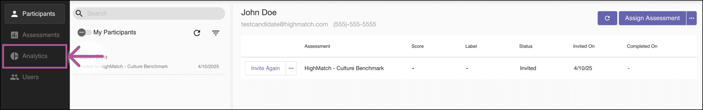
- Log in to your HighMatch account.
- Click the Analytics tab on the side menu located on the left-hand side of the screen.
- Click the Metric drop-down menu > Select Assessment Section Completion Time.

Here you will have several options to view, filter, and download data:

- Explain: Clicking the Explain button will display a metric summary and data points definitions similar to the Metric Summary & Data Points section above.
- Assessment: Allows you to select and filter by individual assessments.
- Compare Toggle: Clicking this option displays the bar chart from the Section Abandonment data, enabling quick comparison between the two charts.

- Bar Chart and Box Plot: You are given an option to view data on either chart.
- Hover: Hovering over any of the points on any of the charts will highlight the specific data for the specific point.
Exporting Data:
There are two ways to export data:


- Analytics | Exports: Clicking the Exports button will take you to the main export page, where you may export several types of data.
- Download (Chart): Clicking the Download icon on on either chart will allow you to:
- Copy Chart to Clipboard: Allows you to copy the image of a chart and paste it into any document.
- Download Chart Image: Allows you to download an image of a chart.
- Download Chart Data as CSV: Allows you to download the data from a chart in a CSV file.